Matplotlib 是一個很流行的 Python 庫,可以幫助你快速方便地構建數據可視化圖表。然而,每次啓動一個新項目時都需要重新設置數據、參數、圖形和繪圖方式是非常枯燥無聊的。本文將介紹 5 種數據可視化方法,並用 Python 和 Matplotlib 寫一些快速易用的可視化函數。下圖展示了選擇正確可視化方法的導向圖。
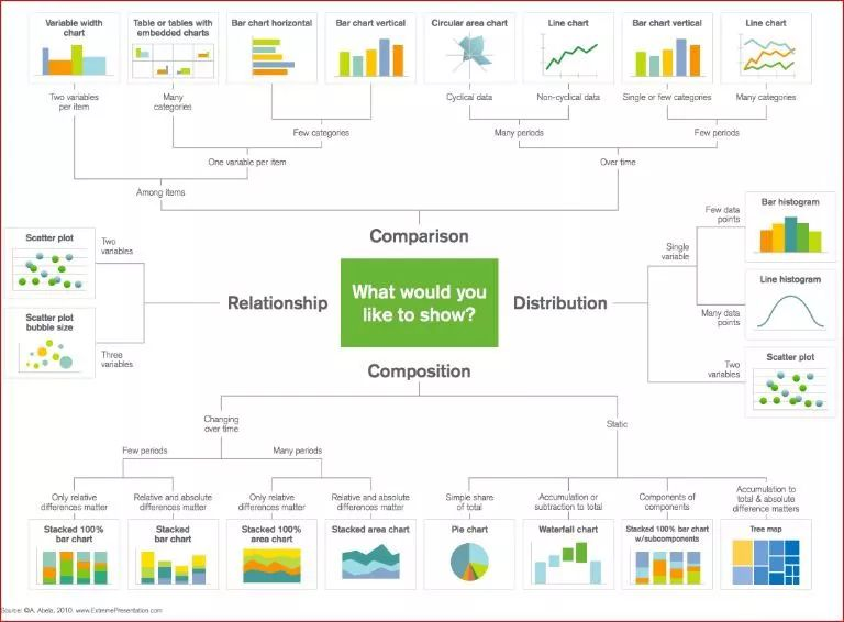
選擇正確可視化方法的導向圖。
散點圖
由於可以直接看到原始數據的分佈,散點圖對於展示兩個變量之間的關係非常有用。你還可以通過用顏色將數據分組來觀察不同組數據之間的關係,如下圖所示。你還可以添加另一個參數,如數據點的半徑來編碼第三個變量,從而可視化三個變量之間的關係,如下方第二個圖所示。
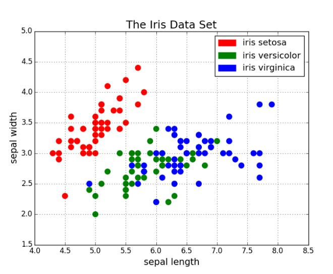
用顏色分組的散點圖。
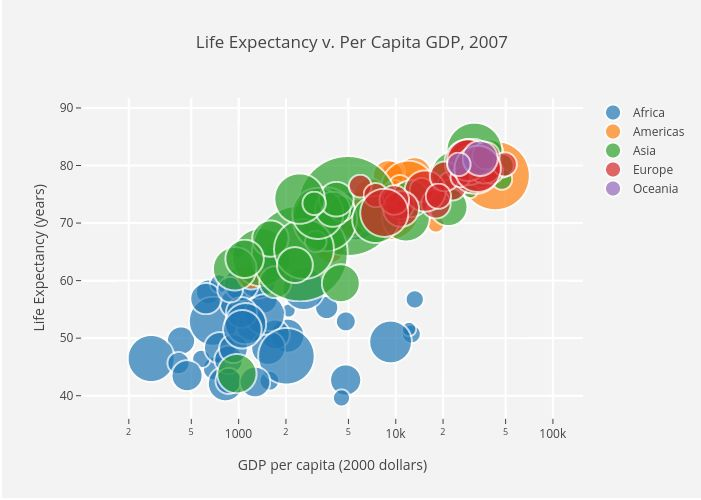
用顏色分組的散點圖,點半徑作爲第三個變量表示國家規模。
接下來是代碼部分。我們首先將 Matplotlib 的 pyplot 導入爲 plt,並調用函數 plt.subplots() 來創建新的圖。我們將 x 軸和 y 軸的數據傳遞給該函數,然後將其傳遞給 ax.scatter() 來畫出散點圖。我們還可以設置點半徑、點顏色和 alpha 透明度,甚至將 y 軸設置爲對數尺寸,最後爲圖指定標題和座標軸標籤。
import matplotlib.pyplot as pltimport numpy as npdef scatterplot(x_data, y_data, x_label="", y_label="", title="", color = "r", yscale_log=False): # Create the plot object _, ax = plt.subplots() # Plot the data, set the size (s), color and transparency (alpha) # of the points ax.scatter(x_data, y_data, s = 10, color = color, alpha = 0.75) if yscale_log == True: ax.set_yscale('log') # Label the axes and provide a title ax.set_title(title) ax.set_xlabel(x_label) ax.set_ylabel(y_label)線圖
當一個變量隨另一個變量的變化而變化的幅度很大時,即它們有很高的協方差時,線圖非常好用。如下圖所示,我們可以看到,所有專業課程的相對百分數隨年代的變化的幅度都很大。用散點圖來畫這些數據將變得非常雜亂無章,而難以看清其本質。線圖非常適合這種情況,因爲它可以快速地總結出兩個變量的協方差。在這裏,我們也可以用顏色將數據分組。
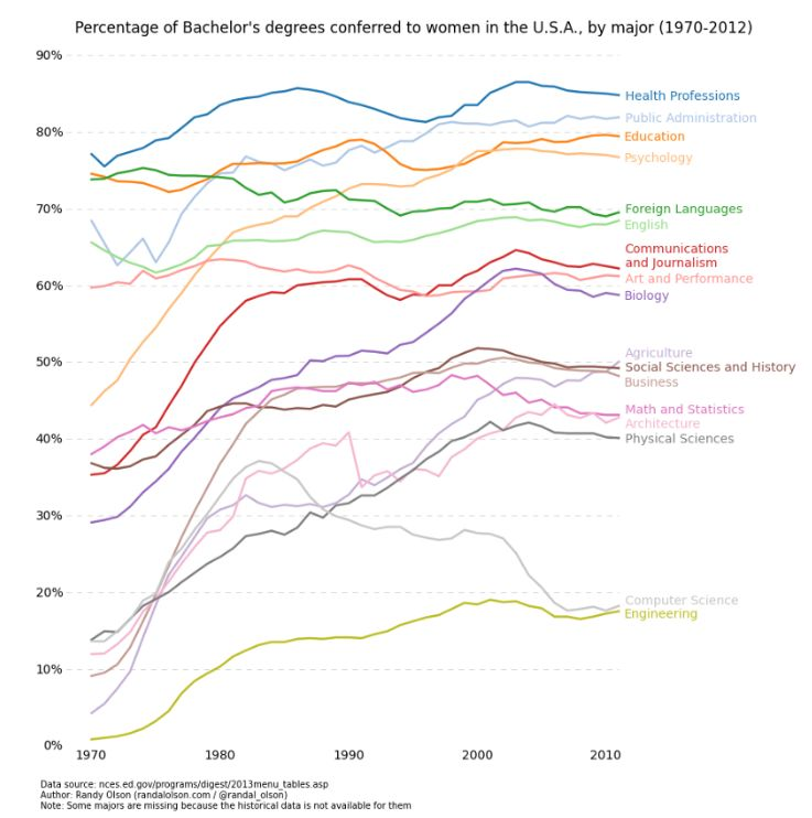
線圖示例。
以下是線圖的實現代碼,和散點圖的代碼結構很相似,只在變量設置上有少許變化。
def lineplot(x_data, y_data, x_label="", y_label="", title=""): # Create the plot object _, ax = plt.subplots() # Plot the best fit line, set the linewidth (lw), color and # transparency (alpha) of the line ax.plot(x_data, y_data, lw = 2, color = '#539caf', alpha = 1) # Label the axes and provide a title ax.set_title(title) ax.set_xlabel(x_label) ax.set_ylabel(y_label)直方圖
直方圖對於觀察或真正瞭解數據點的分佈十分有用。以下爲我們繪製的頻率與 IQ 的直方圖,我們可以直觀地瞭解分佈的集中度(方差)與中位數,也可以瞭解到該分佈的形狀近似服從於高斯分佈。使用這種柱形(而不是散點圖等)可以清楚地可視化每一個箱體(X 軸的一個等距區間)間頻率的變化。使用箱體(離散化)確實能幫助我們觀察到「更完整的圖像」,因爲使用所有數據點而不採用離散化會觀察不到近似的數據分佈,可能在可視化中存在許多噪聲,使其只能近似地而不能描述真正的數據分佈。
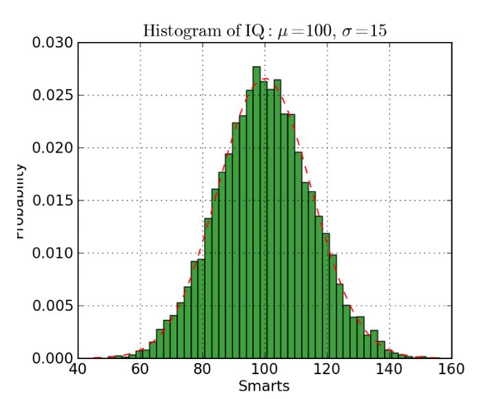
直方圖案例
下面展示了 Matplotlib 中繪製直方圖的代碼。這裏有兩個步驟需要注意,首先,n_bins 參數控制直方圖的箱體數量或離散化程度。更多的箱體或柱體能給我們提供更多的信息,但同樣也會引入噪聲並使我們觀察到的全局分佈圖像變得不太規則。而更少的箱體將給我們更多的全局信息,我們可以在缺少細節信息的情況下觀察到整體分佈的形狀。其次,cumulative 參數是一個布爾值,它允許我們選擇直方圖是不是累積的,即選擇概率密度函數(PDF)或累積密度函數(CDF)。
def histogram(data, n_bins, cumulative=False, x_label = "", y_label = "", title = ""): _, ax = plt.subplots() ax.hist(data, n_bins = n_bins, cumulative = cumulative, color = '#539caf') ax.set_ylabel(y_label) ax.set_xlabel(x_label) ax.set_title(title)如果我們希望比較數據中兩個變量的分佈,有人可能會認爲我們需要製作兩個獨立的直方圖,並將它們拼接在一起而進行比較。但實際上 Matplotlib 有更好的方法,我們可以用不同的透明度疊加多個直方圖。如下圖所示,均勻分佈設置透明度爲 0.5,因此我們就能將其疊加在高斯分佈上,這允許用戶在同一圖表上繪製並比較兩個分佈。
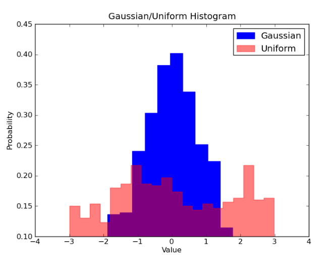
疊加直方圖
在疊加直方圖的代碼中,我們需要注意幾個問題。首先,我們設定的水平區間要同時滿足兩個變量的分佈。根據水平區間的範圍和箱體數,我們可以計算每個箱體的寬度。其次,我們在一個圖表上繪製兩個直方圖,需要保證一個直方圖存在更大的透明度。
# Overlay 2 histograms to compare themdef overlaid_histogram(data1, data2, n_bins = 0, data1_name="", data1_color="#539caf", data2_name="", data2_color="#7663b0", x_label="", y_label="", title=""): # Set the bounds for the bins so that the two distributions are fairly compared max_nbins = 10 data_range = [min(min(data1), min(data2)), max(max(data1), max(data2))] binwidth = (data_range[1] - data_range[0]) / max_nbins if n_bins == 0 bins = np.arange(data_range[0], data_range[1] + binwidth, binwidth) else: bins = n_bins # Create the plot _, ax = plt.subplots() ax.hist(data1, bins = bins, color = data1_color, alpha = 1, label = data1_name) ax.hist(data2, bins = bins, color = data2_color, alpha = 0.75, label = data2_name) ax.set_ylabel(y_label) ax.set_xlabel(x_label) ax.set_title(title) ax.legend(loc = 'best')條形圖
當對類別數很少(<10)的分類數據進行可視化時,條形圖是最有效的。當類別數太多時,條形圖將變得很雜亂,難以理解。你可以基於條形的數量觀察不同類別之間的區別,不同的類別可以輕易地分離以及用顏色分組。我們將介紹三種類型的條形圖:常規、分組和堆疊條形圖。
常規條形圖如圖 1 所示。在 barplot() 函數中,x_data 表示 x 軸上的不同類別,y_data 表示 y 軸上的條形高度。誤差條形是額外添加在每個條形中心上的線,可用於表示標準差。
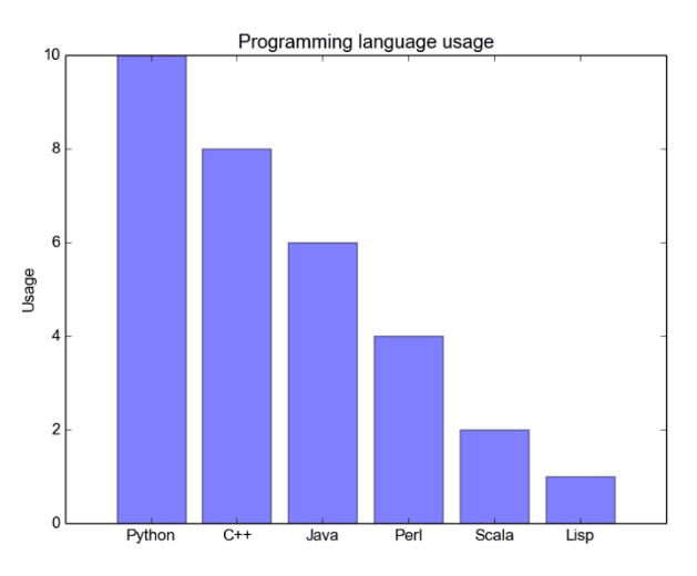
常規條形圖
分組條形圖允許我們比較多個類別變量。如下圖所示,我們第一個變量會隨不同的分組(G1、G2 等)而變化,我們在每一組上比較不同的性別。正如代碼所示,y_data_list 變量現在實際上是一組列表,其中每個子列表代表了一個不同的組。然後我們循環地遍歷每一個組,並在 X 軸上繪製柱體和對應的值,每一個分組的不同類別將使用不同的顏色表示。
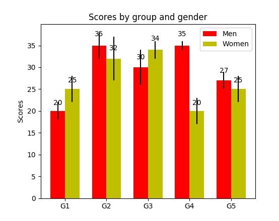
分組條形圖
堆疊條形圖非常適合於可視化不同變量的分類構成。在下面的堆疊條形圖中,我們比較了工作日的服務器負載。通過使用不同顏色的方塊堆疊在同一條形圖上,我們可以輕鬆查看並瞭解哪臺服務器每天的工作效率最高,和同一服務器在不同天數的負載大小。繪製該圖的代碼與分組條形圖有相同的風格,我們循環地遍歷每一組,但我們這次在舊的柱體之上而不是旁邊繪製新的柱體。
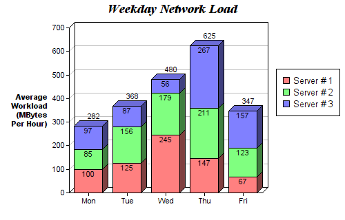
堆疊條形圖
def barplot(x_data, y_data, error_data, x_label="", y_label="", title=""): _, ax = plt.subplots() # Draw bars, position them in the center of the tick mark on the x-axis ax.bar(x_data, y_data, color = '#539caf', align = 'center') # Draw error bars to show standard deviation, set ls to 'none' # to remove line between points ax.errorbar(x_data, y_data, yerr = error_data, color = '#297083', ls = 'none', lw = 2, capthick = 2) ax.set_ylabel(y_label) ax.set_xlabel(x_label) ax.set_title(title)def stackedbarplot(x_data, y_data_list, colors, y_data_names="", x_label="", y_label="", title=""): _, ax = plt.subplots() # Draw bars, one category at a time for i in range(0, len(y_data_list)): if i == 0: ax.bar(x_data, y_data_list[i], color = colors[i], align = 'center', label = y_data_names[i]) else: # For each category after the first, the bottom of the # bar will be the top of the last category ax.bar(x_data, y_data_list[i], color = colors[i], bottom = y_data_list[i - 1], align = 'center', label = y_data_names[i]) ax.set_ylabel(y_label) ax.set_xlabel(x_label) ax.set_title(title) ax.legend(loc = 'upper right')def groupedbarplot(x_data, y_data_list, colors, y_data_names="", x_label="", y_label="", title=""): _, ax = plt.subplots() # Total width for all bars at one x location total_width = 0.8 # Width of each individual bar ind_width = total_width / len(y_data_list) # This centers each cluster of bars about the x tick mark alteration = np.arange(-(total_width/2), total_width/2, ind_width) # Draw bars, one category at a time for i in range(0, len(y_data_list)): # Move the bar to the right on the x-axis so it doesn't # overlap with previously drawn ones ax.bar(x_data + alteration[i], y_data_list[i], color = colors[i], label = y_data_names[i], width = ind_width) ax.set_ylabel(y_label) ax.set_xlabel(x_label) ax.set_title(title) ax.legend(loc = 'upper right')箱線圖
上述的直方圖對於可視化變量分佈非常有用,但當我們需要更多信息時,怎麼辦?我們可能需要清晰地可視化標準差,也可能出現中位數和平均值差值很大的情況(有很多異常值),因此需要更細緻的信息。還可能出現數據分佈非常不均勻的情況等等。
箱線圖可以給我們以上需要的所有信息。實線箱的底部表示第一個四分位數,頂部表示第三個四分位數,箱內的線表示第二個四分位數(中位數)。虛線表示數據的分佈範圍。
由於箱線圖是對單個變量的可視化,其設置很簡單。x_data 是變量的列表。Matplotlib 函數 boxplot() 爲 y_data 的每一列或 y_data 序列中的每個向量繪製一個箱線圖,因此 x_data 中的每個值對應 y_data 中的一列/一個向量。
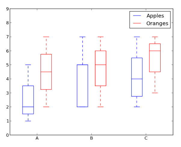
箱線圖示例。
def boxplot(x_data, y_data, base_color="#539caf", median_color="#297083", x_label="", y_label="", title=""): _, ax = plt.subplots() # Draw boxplots, specifying desired style ax.boxplot(y_data # patch_artist must be True to control box fill , patch_artist = True # Properties of median line , medianprops = {'color': median_color} # Properties of box , boxprops = {'color': base_color, 'facecolor': base_color} # Properties of whiskers , whiskerprops = {'color': base_color} # Properties of whisker caps , capprops = {'color': base_color}) # By default, the tick label starts at 1 and increments by 1 for # each box drawn. This sets the labels to the ones we want ax.set_xticklabels(x_data) ax.set_ylabel(y_label) ax.set_xlabel(x_label) ax.set_title(title)箱線圖代碼
結論
本文介紹了 5 種方便易用的 Matplotlib 數據可視化方法。將可視化過程抽象爲函數可以令代碼變得易讀和易用。Hope you enjoyed!
原文地址:https://towardsdatascience.com/5-quick-and-easy-data-visualizations-in-python-with-code-a2284bae952f